Dough Eyes
Proposition
Pie-eyed Pupil of Pizza
Year
2026
Brand
STRATEGY
BRAND IDENTITY
MESSAGING AND TONE
ILLUSTRATION
SIGNAGE AND WAYFINDING
Digital
TOOLKIT
WEBSITE
SOCIAL CONTENT
TEMPLATES
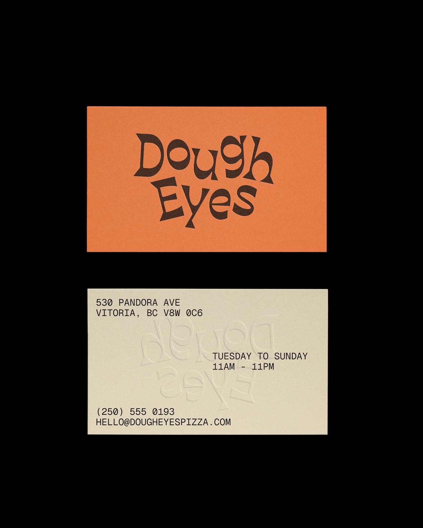
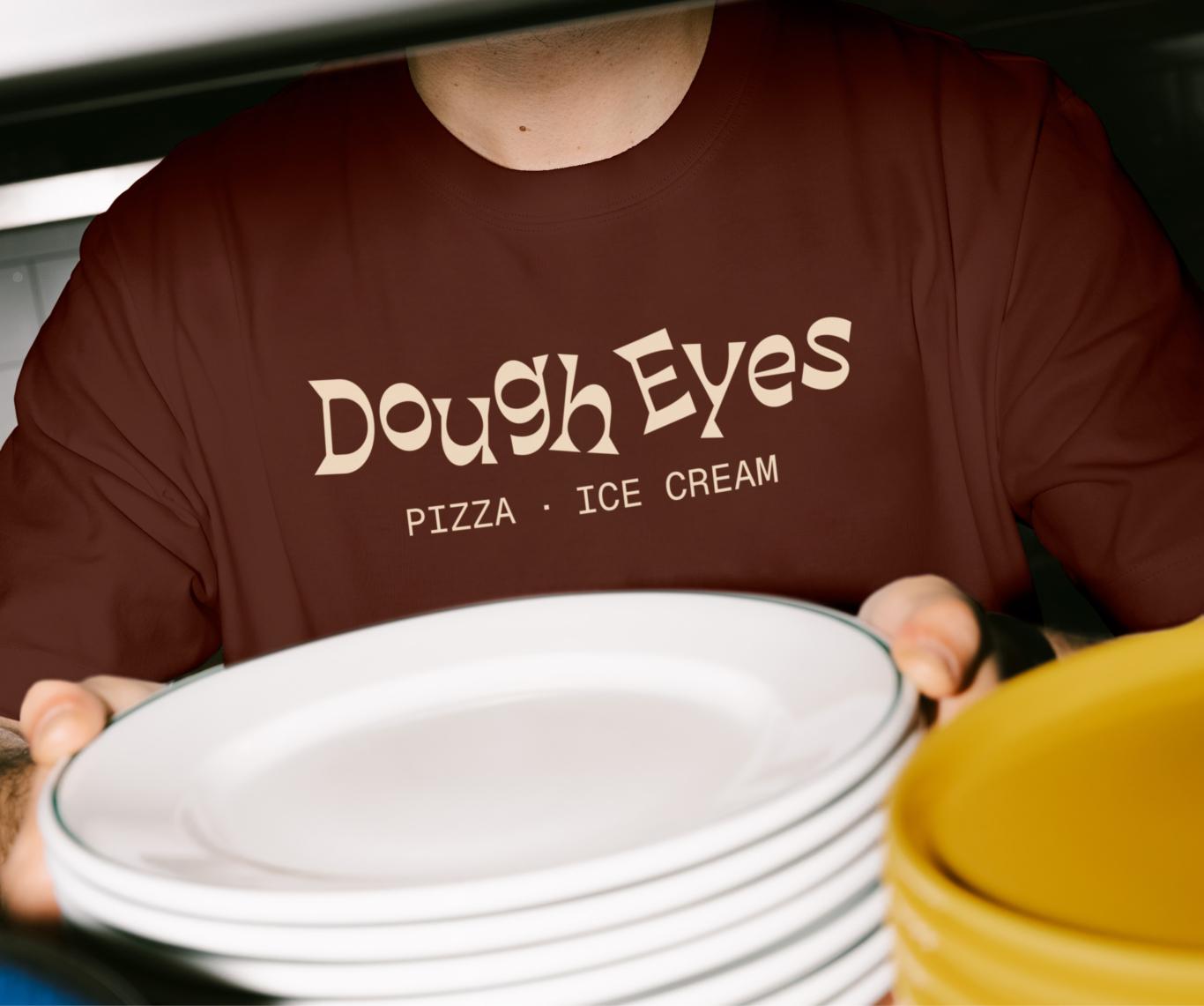
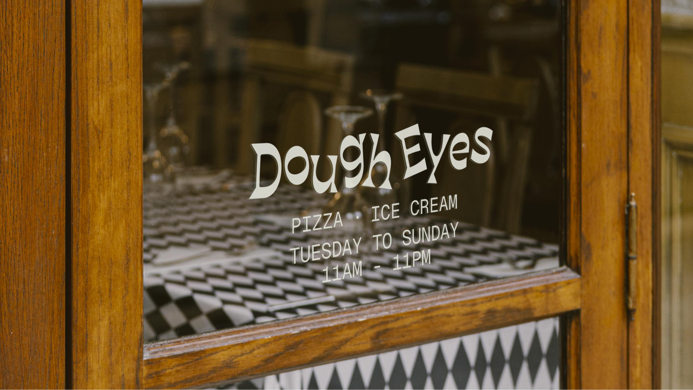
There are very few loves like the love of pizza. Dough Eyes is a business built on such a love; a pie-eyed love of pizza. With a restaurant and a slice shop in Victoria BC, the team at Dough Eyes know that there are always more reasons to love pizza.
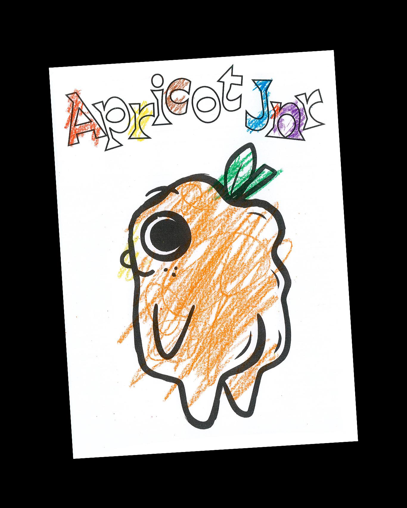
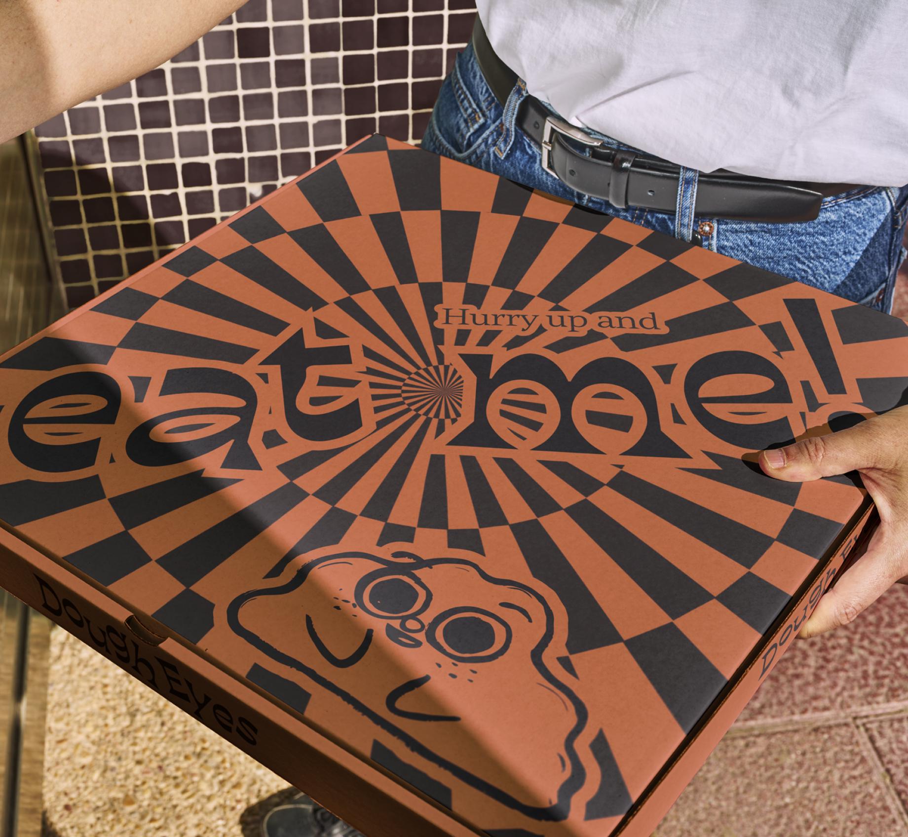
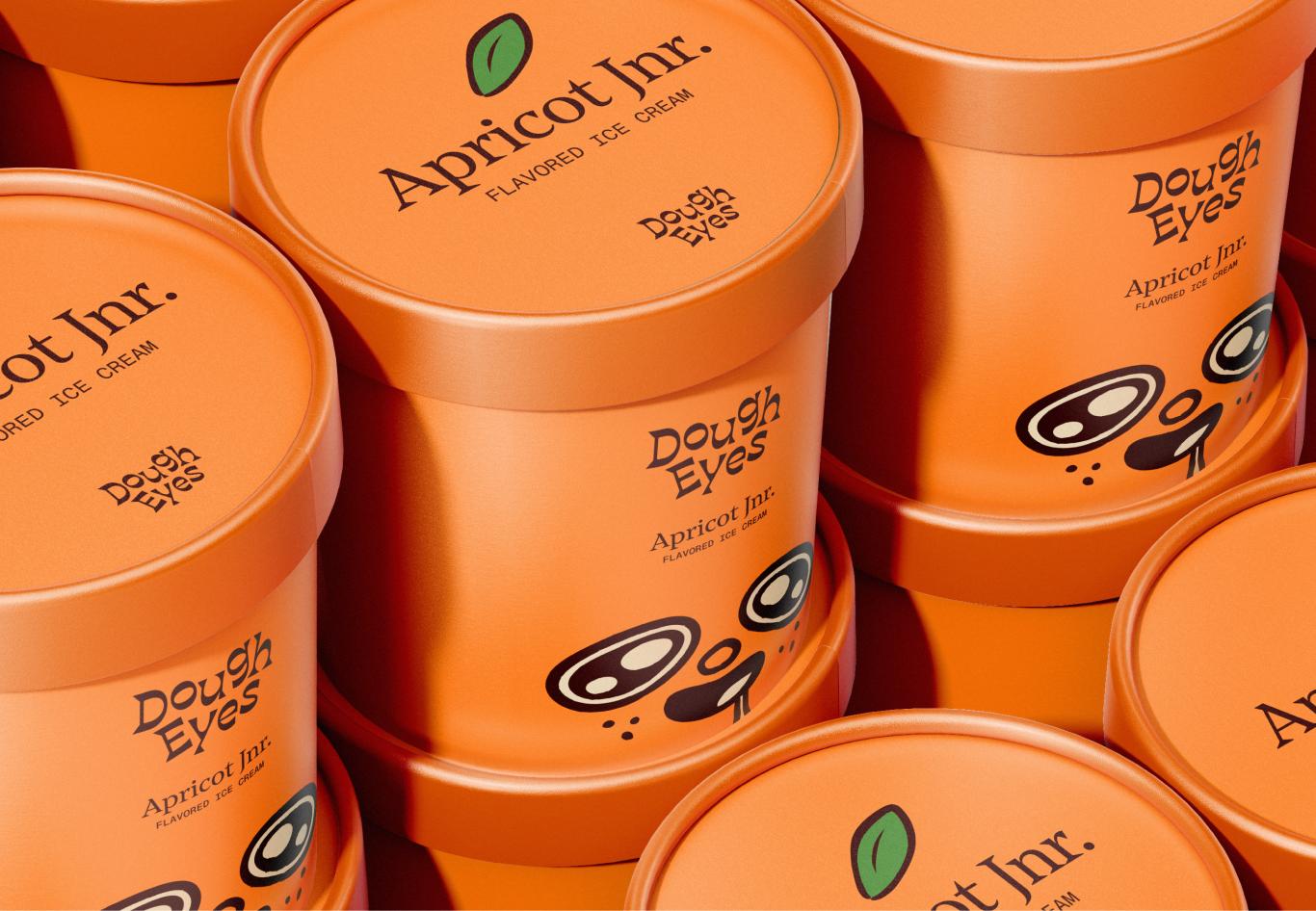
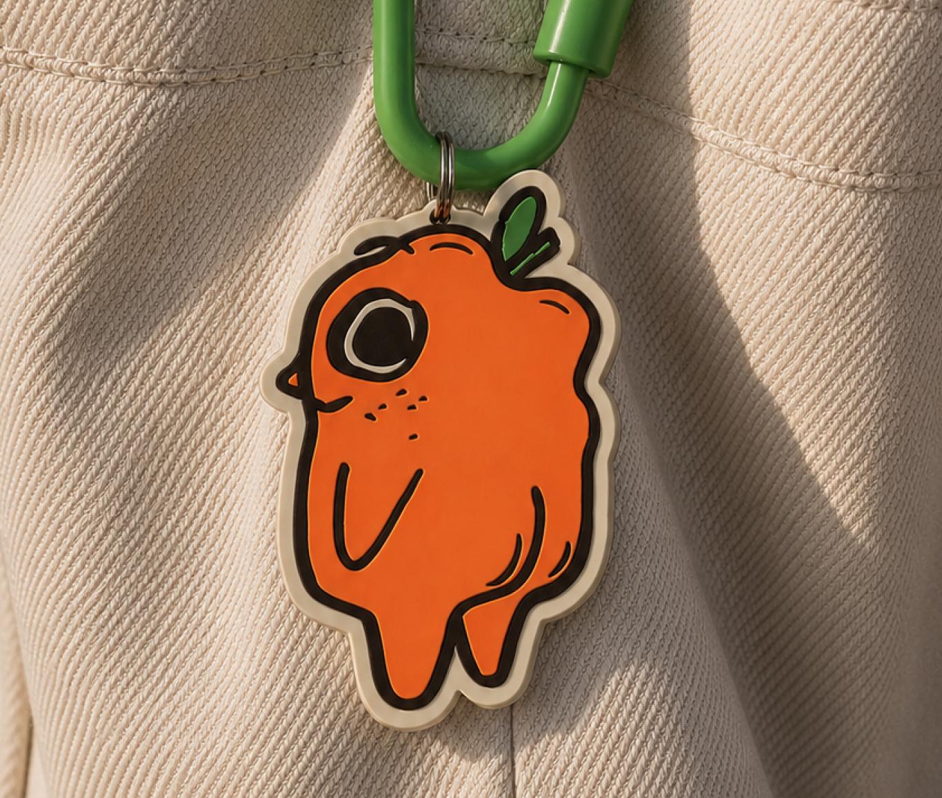
Drawing inspiration from their signature sourdough starter Apricot Junior, we built a delightful identity that welcomes and woos you towards a perfect slice. Apricot Jr. is (k)needy, he needs to make pizza, he needs to be near it, he needs YOU to eat it. A hypnotic graphic language and outrageous choice of type evokes a sense of hysteria, the sort that overtakes you when you love something as much as Apricot Jr. loves pizza.